Understanding Design
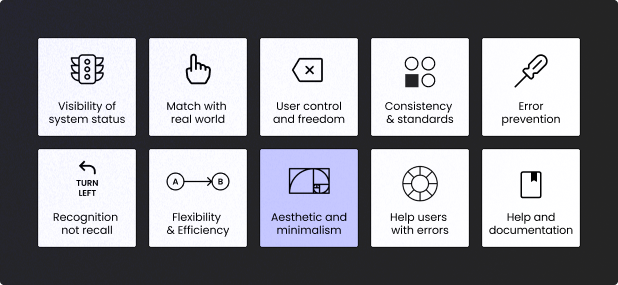
Usability heuristics are a set of principles that guide the creation of user-friendly interfaces. These heuristics, introduced by Jakob Nielsen and Don Norman, are essential for conducting effective UX audits and ensuring that websites and applications are intuitive and efficient for users. Let’s delve into these heuristics and explore how they can be applied during a UX audit, providing examples for each one.
Understanding Usability Heuristics
Heuristics are essentially rules of thumb that help in designing a functional and user-friendly interface. Adhering to these principles ensures that the design is not only aesthetically pleasing but also easy to use. Here are the key heuristics outlined by Nielsen and Norman, along with practical examples and how to incorporate them into your audit process.
1. Visibility of System Status
- Example: A progress bar that shows the completion percentage during a file upload process.
- Audit Check: Does the system provide immediate feedback to users’ actions? For example, is there a loading spinner when data is being fetched or a confirmation message when an action is completed?
2. Match Between System and the Real World
- Example: A shopping cart icon in an e-commerce site that resembles a physical cart, indicating where items are stored before purchase.
- Audit Check: Review the language and icons used in the interface. Are they easily understandable? Do they align with users’ real-world experiences?
3. User Control and Freedom
- Example: A “Cancel” button during a multi-step form submission process and back & forth navigation allowing users to go back and edit previous steps.
- Audit Check: Test the interface for undo and redo functionalities. Can users easily reverse their actions?
4. Consistency and Standards
- Example: Using the same color for all clickable buttons across the website to indicate their interactivity.
- Audit Check: Analyze the design for consistency in terms of fonts, colors, button styles, and navigation. Ensure that similar actions and elements are uniform throughout the interface. Besides, ensure that the interface is build according to the universe standards as users expect your website to work the same way as other websites.
5.Error Prevention
- Example: An e-commerce site that disables the “Submit” button until all required fields are filled out correctly.
- Audit Check: Look for proactive measures that prevent errors, such as input validation and confirmation dialogs. Tooltips and notification also might help the user to move through your interface easily and error-free.
6. Recognition Rather Than Recall
- Example: Showing a dropdown menu with previously entered search terms when users start typing in the search bar.
- Audit Check: Evaluate how information is presented. Are options and actions visible, reducing the need for users to remember details? Don’t hide something that can be open unless it is absolutely necessary, it may distract and upset users.
7. Flexibility and Efficiency of Use
- Example: Keyboard shortcuts for frequent actions in a text editor, such as Ctrl+C for copy and Ctrl+V for paste.
- Audit Check: Identify shortcuts and advanced features for experienced users. Ensure that these do not complicate the interface for beginners.
8. Aesthetic and Minimalist Design
- Example: A landing page with a clean design, featuring only essential information and a clear call-to-action button.
- Audit Check: Assess the overall design. Is it free from unnecessary elements? Is the information presented clearly and concisely? If you can’t explain the purpose of an element, get rid of it.
9. Help Users Recognize, Diagnose, and Recover from Errors
- Example: An error message that states “Incorrect password. Please try again,” and provides a link to reset the password.
- Audit Check: Review error messages. Are they helpful and do they provide clear instructions for resolving issues?
10. Help and Documentation
- Example: An online help center with a searchable FAQ section and step-by-step tutorials.
- Audit Check: Check the availability and accessibility of help resources. Is the documentation easy to find and understand?
The Intersection of Design and Usability
I have highlighted Minimalistic and Aesthetic Design because it’s important to note that design plays a crucial role in usability. Interestingly, users perceive aesthetically pleasing designs as more usable, often overlooking minor technical issues. This means that high-quality design even can mitigate some usability problems, though it cannot compensate for critical errors, such as an inability to complete a purchase or fill out a form.
In summary, applying usability heuristics in UX audits helps in identifying and addressing potential issues, ensuring that the interface is both user-friendly and visually appealing. By integrating these principles into your design process, you can create products that not only meet users’ needs but also delight them, ultimately driving business success.

